
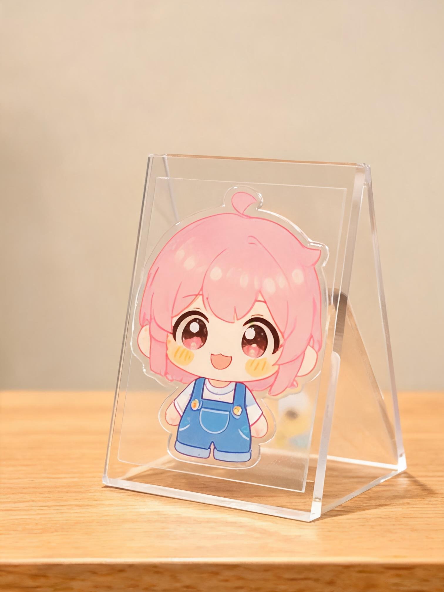
A standee has one job: stop someone walking past. The difference between a piece that works and one that gets ignored is rarely the artwork alone — it is size, distance, base stability and how the acrylic is printed.
1. Design for the viewing distance
A counter standee is read from half a metre; a window piece from two or three metres. At close range, small type and fine detail work. At a distance, simplify: one subject, one message, strong contrast. If a customer has to lean in to understand it, the design is too busy for its position.
2. Give the artwork room to breathe
Because the sheet is cut to the outline, the shape itself becomes part of the design. Leave a margin between the artwork and the cut edge — typically 3–5 mm — so the edge does not clip the subject. For character standees, a contour cut close to the figure looks sharp; for photo standees, a simple rectangular or rounded shape usually reads better.
3. Think about the base before the artwork
The base determines whether the standee stays upright. A tall, narrow design on a small round base will tip in a busy shop. Options that work:
- Slot-in base: simple, flat-pack, good for lightweight pieces.
- Screw-fixed base: more stable and easy to replace if damaged.
- Wider oval or rectangular base: best for tall designs and high-traffic counters.
- Bonded L-shape: a clean look for table signs, but it takes more packing space.
As a rule, the base should be at least one third of the total height for a freestanding counter piece. If the design is top-heavy, increase sheet thickness rather than just enlarging the base.
4. Use white ink on clear acrylic
Printing CMYK straight onto clear acrylic makes colours look transparent and washed out. A white ink base underneath the colour gives opacity and keeps skin tones, brand colours and product shots accurate. For images that must be pure and glossy, print on the reverse side so the acrylic itself protects the ink.
5. Choose the right thickness
3 mm is the everyday choice for small and medium standees. 4–5 mm gives a more premium feel and resists bowing on larger pieces. Thicker is not automatically better: it adds weight, cost and freight volume, and it can make a slot base harder to assemble.
6. Plan the packing early
Retail standees are often shipped in bulk to stores, not to end customers. Individually sleeving each piece prevents scuffing, and keeping the protective film on until installation saves a surprising amount of damage. If the base is separate, pack it in the same sleeve so the pair stays together.
A quick checklist before you approve artwork
- Is the main message readable at the real viewing distance?
- Is there a safe margin between artwork and cut line?
- Does the base match the height and weight of the piece?
- Have you approved a printed sample on the actual acrylic?
- Will the packing protect the edges and printed face?
Send us the artwork and tell us where the standee will stand. We will flag the practical issues before the file goes into production.